Joy UI palette generator
A procedural, accessible palette generator for the MUI Joy library, working in the OKLCH colour space.
At a glance
- TypeScript, React, OKLCH
Tags
Generates accessible colour palettes for Joy UI in OKLCH, with gamut mapping to sRGB, WCAG 2.1 and APCA contrast validation, all five semantic palettes, and exports to TypeScript, CSS variables, JSON and Tailwind.
What it produces
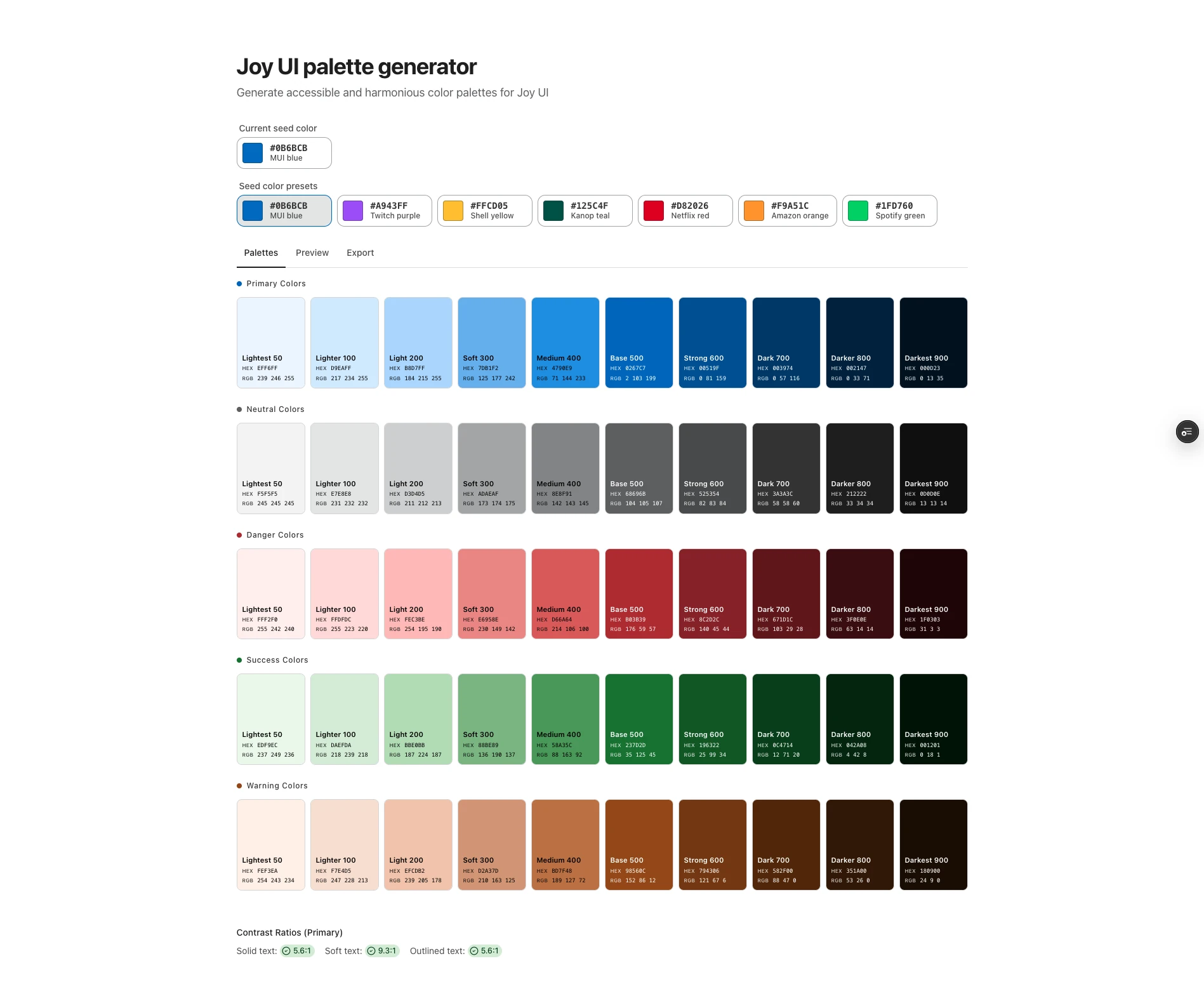
From one seed colour, it generates the five palettes Joy UI expects (primary, neutral, danger, success and warning), each with ten steps from 50 to 900. The neutral palette is tinted toward the primary hue, and the semantic ones sit at fixed hues: red for danger, green for success and amber for warning.
How it works
It works in OKLCH, because equal steps in lightness look equal, saturation behaves the same across hues and modern browsers understand it natively. Each step has a lightness anchor, from 0.97 at the lightest to 0.16 at the darkest, and a chroma curve that peaks at the 500 step, which is the colour of buttons. Colours that fall outside sRGB are brought back by reducing their chroma while keeping hue and lightness.
Accessibility
The result is checked against the way Joy UI uses it: white text on the 500 step for solid buttons, the 700 step on the 100 step for soft ones, the 500 step on the page for outlined ones, and borders at 3:1. Contrast is shown both as WCAG 2.1 ratios and as APCA values.
Using it
The app previews the palettes with a button preview, shows the contrast results, then exports the theme as Joy UI code, CSS custom properties, JSON for design tools or Tailwind. The generation code is a small library that can be used on its own.